Introduction to Storybook
An open source tool for developing UI components in isolation for React, Vue, Angular, and more

Update 2018: I cowrote LearnStorybook.com, a free 9 chapter tutorial on getting started with Storybook. Read the announcement »
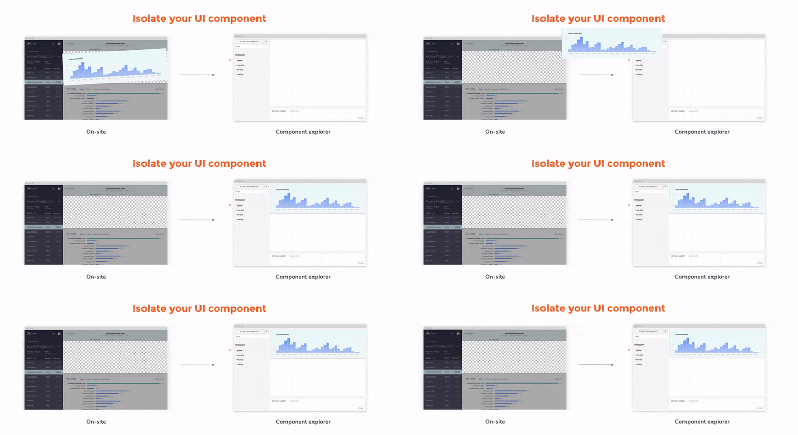
Storybook is a Component Explorer — a tool for working on a single component in isolation — built for React and React Native. As of this article, it’s likely the most popular and fullest featured component explorer out there.
The team here at Chroma, along with others at Airbnb, Slack, and Coursera, rely on Storybook to build cutting edge user interfaces (UIs).
Why should you be interested? Apart from all the benefits of component explorers including developing one component at a time, Storybook has some stand out features that deserve a closer look.
Writing Stories
The primary purpose of a component explorer is to allow you to isolate and work on a component in by itself, rather than in the larger context of a complete application.

To do this, you describe exactly the inputs the component should see — the “state” of the component. The explorer will then simply render the component in that state. This is advantageous because it allows you get the component just the way you need, without having to manipulate a larger application to achieve that state in the context of the whole app.
To get the component into the state you want you write a story, which is Storybook’s API for describing states in terms of a rendered React element — i.e. a component and set of props:
storiesOf('Task')
  .add('inbox task', () => (
    <Task task={{
      title: "Test Task",
      subtitle: "on TestBoard",
      state: "TASK_INBOX",
    }} />
  ));
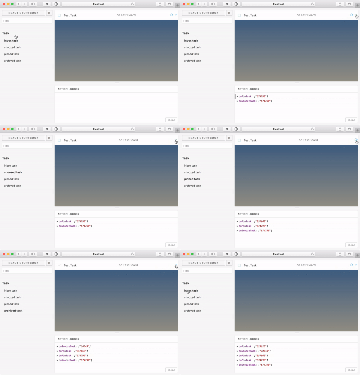
Once you’ve written a story, it’s simply a matter of browsing to the story inside the storybook UI to see that component rendered with props you’ve supplied it.


Decorators
Although it is desirable to write components that render independently of the environment they are use in, often a component does rely on certain global things. Typical examples are:
- The component’s CSS is scoped assuming it is rendered inside a given (set of) CSS classes or HTML tags. e.g.,
.task-wrapper > .task { \\ } - The component assumes things about its ancestors’ styles (for instance a
background-color, or a certain inheritedfonttag). - The component expects certain information from the React context (usually supplied by ancestor components that follow the provider pattern: think Redux Providers, React Routers, Apollo Providers).
When writing the stories for a given component, you can attach a decorator which simply wraps the component in some extra React code. This can be as simple as wrapping in a div with a certain class or style:
storiesOf('Task')
  .add('inbox task', () => (
    <div className="wrapper">
      <Task {...} />
    </div>
  ));
Or as complex as a mocked provider:
import { MemoryRouter } from 'react-router';

storiesOf('Task')
  .add('inbox task', () => (
    <MemoryRouter initialEntries={['/some/path']}>
      <Task {...} />
    </MemoryRouter>
  ));
If you want to use the same decorator for every story for a given component, use .addDecorator:
storiesOf('Task')
  .addDecorator(story => (
    <div className="wrapper">
      {story()}
    </div>
  ))
  .add('inbox task', () => (
    <Task {...} />
  ));
If you want to use the same decorator for every story in your app, import addDecorator from Storybook:
import { addDecorator } from '@storybook/react';

addDecorator(story => (
  <div id="app-root">
    {story()}
  </div>
));
Addons
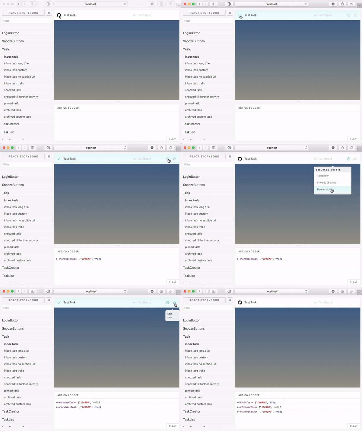
Besides the basic API we’ve seen to write a story, Storybook features a plugin system which allows powerful add-ons to both change the behaviour of stories and add custom panes in the development environment .
These powerful add-ons help you customize Storybook to:
- Create a living styleguide by further documenting your components with the info, README, and notes add-ons.
- Drive a test suite by adding assertions or run visual tests with the specs and storyshots add-ons.
- Expand your stories to see them in various combinations and backgrounds with knobs, host, props combinations, and more.
Actions
Many components take some callbacks that are provided by their parent and are expected to be triggered when an action happens on that component. Storybook has an interesting add-on which allows you to pass an “action” into the story and when the callback fires, a message is logged in the interface:
import { action } from '@storybook/addon-actions';

storiesOf('Task')
  .add('inbox task', () => (
    <Task task={{
      {...}
      onArchive={action('onArchive')}
      onSnooze={action('onSnooze')}
    }} />
  ));
Getting started
The easiest way to get started with Storybook is to use the getstorybook tool, a CLI that scans your app and will make the (small) changes required to get storybook working. You can use it like so:
npm install --global @storybook/cli

cd [your-app]
getstorybook
Requiring stories
getstorybook will add a folder to your app called .storybook/ which includes a file config.js. This file is the “entrypoint” for your storybook and from here you need to require each file that contains a story for any component. The default is simply to start at a file named stories/index.js, although you can customize this.
Providing global styles
If your app uses global styles that are required from an index.js (or even directly embedded in the <head> tag) that are required to render a component correctly, you’ll need to require() those styles from the .storybook/config.js file.
import { configure } from '@storybook/react';

// By importing your application's CSS here, we ensure it's included
// for each story
import '../index.css';

function loadStories() {
  require('../stories/index.js');
}

configure(loadStories, module);
Storybook webpack configuration
Storybook ships with its own webpack configuration which closely mirrors that of create-react-app. This means that when you run storybook and it requires your story files, it will only work if those files themselves only require() things that that configuration can understand.
In particular, the configuration does not include any CSS preprocessors. If you have a more complicated webpack config that your components rely on, you can provide a .storybook/webpack.config.js and tweak storybook’s config to mirror your app’s:
const path = require('path');

module.exports = {
  module: {
    loaders: [
      {
        test: /\.scss$/,
        loaders: ["style", "css", "sass"],
        include: path.resolve(__dirname, '../')
      }
    ]
  }
};
You can do much more complex things to the webpack config: read more about it.
Getting involved
Storybook was originally developed by Kadira, a company spearheaded by Arunoda Susiripala. The project was recently handed off to community maintainers (I’m one of them!). We are always looking for help in making the project better. If you want to get your hands dirty here are a few simple things you can do:
- Report issues: Use the tool and report issues or ideas at the bug tracker.
- Issue triage: It’s always useful to have more eyes on issues, helping with reproductions and triaging them. Read the guidelines, and chip in to help out.
- Write code: If you are interested in writing code to help, then the community guidelines are a great place to start. Join the Storybook Slack channel to ask questions and seek guidance on ideas.
The Future
Storybook is a young project that’s picking up momentum. Version 3 was recently released, with full support for Webpack 2. The project has an ambitious roadmap that is being planned right now.
In the meantime Storybook is an excellent tool for Component-Driven Development, and an invaluable tool for developing future frontends.